
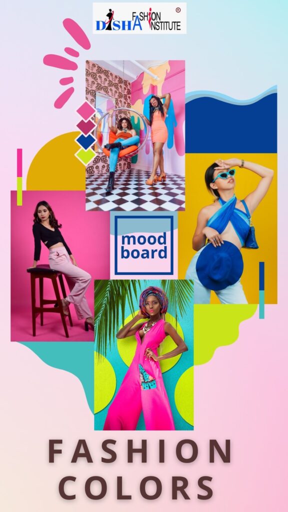
Are you ready to discover the mesmerizing impact of color psychology in the realm of fashion design? Have you explored the transformative role that color plays in fashion design?
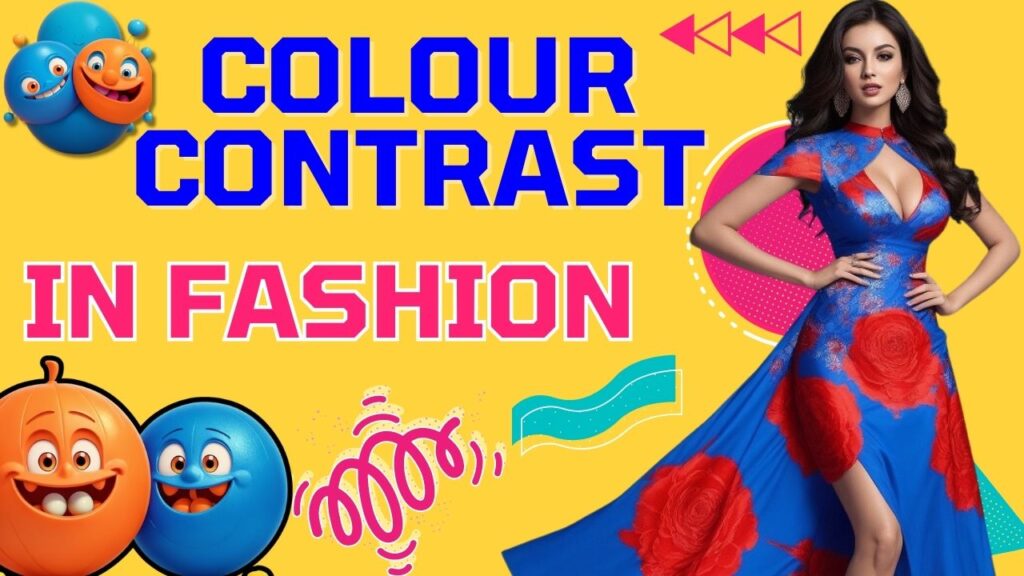
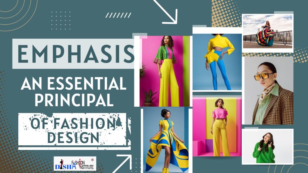
Experience the Magic of Color. Color is the most important element of fashion design. Color holds the incredible ability to create contrast, establish harmony, and strike a delicate balance within garments. Fashion designers leverage the principles of color psychology in fashion design, employing complementary, analogous, or other color schemes to craft visually pleasing combinations. If you do not understand the terms color scheme, complementary color etc, do not worry. You will understand everything after completing our tutorials on color theory in fashion design.
In this blog post, we will delve into the captivating world of color symbolism, history, and profound impact on human life, desires, choices, moods etc. Basically, we’re going to talk about color psychology and how it affects fashion design. Furthermore, our upcoming blog posts will delve into topics such as the Color Wheel, Color Schemes, and provide valuable insights on how to effectively select colors for your designs based on these schemes.
Table of Contents
The Dynamic Realm of Color Psychology: Exploring Uses and Impacts
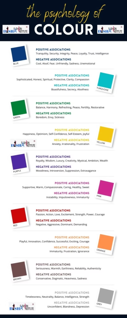
Color possesses incredible power as a communication tool, capable of signalling action, shaping moods, and even eliciting physiological reactions. With the ability to impact our emotions, behaviours, and overall well-being, it holds a huge influence on human psychology and personality.
#1 Color Communicates Invisibly
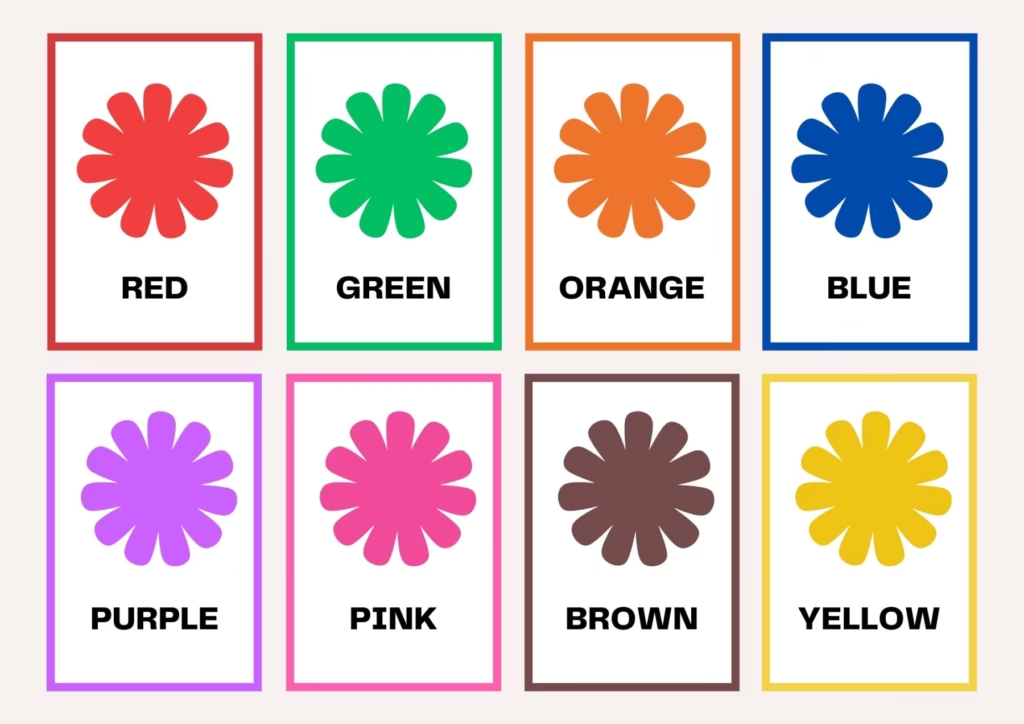
Different Colors communicate different qualities
- Yellow – warm, exciting, happy
- Blue – deep, peaceful, supernatural
- Green – peace, stillness, nature
- White – harmony, silence, cleanliness
- Black – grief, dark, unknown
- Red – glowing, confidence, alive
- Orange – radiant, healthy, serious
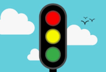
#2 Color as a Source of Information
Example: Traffic Light
It can also be a source of information. Our brain can store and process visuals faster than text. About 90 per cent of the information is transmitted by our brain as visuals. Even before we learned to read we began to associate colors with shapes and objects.
Everywhere in the world color is used to control traffic because of brain reads color much faster than text. Color coding is a way to convey information quickly which facilitates visual search.
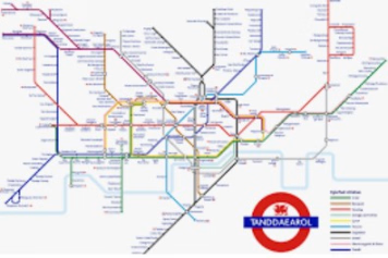
Example: Tube Rail Map
The picture shows the famous London tube rail map. In this map, colour-coded lines represent the different rail lines. Different colors make it easier to visually follow the path of a rail line speeding up the search process of the traveller. This is one of the most extensive uses of colors. There are many railway maps in the world which are color coded in the similar way.
#3 Color As a Symbol
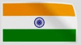
Every flag colour of each country in the world reflects the culture, heritage, ethnicity, historical symbolism and the people of the geographic location. In the Indian flag, saffron color stands for courage and sacrifice. Whereas white signifies truth and peace. On the other hand, the green reflects faith and prosperity.
#4 Color Psychology With Respect to Mother Nature
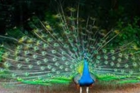
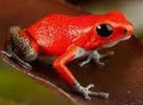
Knowingly and unknowingly we experience psychological responses to colors. We learn colors from nature and nature is full of colors. We are always surrounded by colors. In the animal kingdom color is sometimes used to attract partners, on the other hand, sometimes it signals danger. You can understand this by observing the glorious peacock. When they show their colourful feathers, it is actually attracting their partner. You can also observe this from the poisonous red frog. The poisonous frog’s color is red. The red signifies the danger.
#5 Color Psychology on Mood and Well-being
Many of us have a favourite color or we prefer certain colors over others. The reason behind this is that colors can affect our moods, so we tend to surround ourselves with colors that have a positive impact on how we feel.
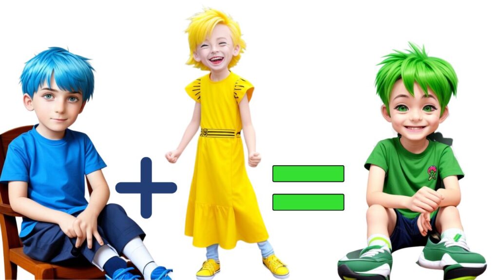
For example, red can boost our energy, yellow often makes people feel happier, and blue has been proven to lower blood pressure and slow down heart rate, which is why it’s associated with relaxation. When you combine the happiness of yellow and the calming effect of blue, you get green, which is a color that many people find pleasing.
In mental health units, pastel tones are often used on the walls to create a calm, happy, and relaxed atmosphere for patients. A popular combination is beige walls with a hint of pink, along with mint green floors, as it is believed to create a soothing and harmonious environment. On the other hand, schools tend to use bright colors that appeal to children. When choosing colors for your next design, it’s important to consider how they will combine with other elements on the page and the impact they will have on the mood of your audience.
#6 Cultural Significance of Colors in Design
Colors hold different meanings in various cultures, as pointed out by Petterson (2004). This knowledge is crucial for designers because without understanding the cultural significance of a specific color, they run the risk of offending their target audience.
For example, In many countries, Red symbolizes good health. Children always wore a piece of red clothing for this reason. The most red stones like ruby are believed to have health-giving and disease-preventing properties.
In another instance, purple is associated with mourning in Thailand, while in Western culture, it signifies royalty, luxury, wealth, and sometimes even magic. Despite this difference, Thai Airways, for example, uses purple as their brand color. At first, it may seem like a major mistake, considering the mourning connotation in Thailand. However, it’s likely that the Thai Airways website is intended for tourists rather than locals. When Westerners visit the site and see purple, it associates Thai Airways with values such as luxury and comfort.

Similar variations can be seen with other colors:
- In Western cultures, black is a color of mourning.
- In Japan, black symbolizes honour, while white represents mourning.
- Red in the West signifies danger, love, and passion.
- In India, red symbolizes purity, while in China it signifies good luck, and in South Africa, it represents mourning.
- Yellow denotes courage in Japan, mourning in Egypt, and hope in the West.
#7 Color Psychology and Seasonal Significance
Our world is a captivating tapestry of vibrant colors, constantly evolving and offering a boundless source of inspiration for designers (Bell, 2004). One remarkable aspect is the ever-changing palette that accompanies each season, showcasing nature’s artistic prowess. From the rich, warm oranges of autumn leaves to the crisp, cool blues of a winter sky, each season brings forth its unique color scheme, lending itself perfectly to the world of design. By simply gazing out of your window, you can absorb the harmonious hues of nature and translate them into your creative endeavours.
Embracing the seasonal colors in your designs not only adds visual appeal but also creates a deep connection with the world around us. Autumn’s fiery oranges and golden yellows evoke feelings of warmth, cosiness, and a bittersweet farewell to summer. Winter’s serene blues and icy whites bring a sense of tranquillity, purity, and the enchantment of snow-covered landscapes. Spring bursts forth with vibrant pastels, symbolizing renewal, vitality, and the awakening of nature. Summer dazzles with its vibrant array of bold and bright colors, exuding energy, playfulness, and the joyous spirit of the sun.
By drawing inspiration from nature’s chromatic symphony, your designs will embody the essence of each season, telling a captivating story through color. It encourages a shift in perspective, allowing us to slow down and appreciate the intricate details and hidden wonders that surround us. So, as you embark on your creative journey, pause, take in the world’s magnificent hues, and let them infuse your designs with the magic of the seasons.
#8 Color Psychology with Respect to Politics

Colors have long been associated with political parties, carrying significant meaning and symbolism. Understanding these associations can be valuable when designing, especially considering your audience. While the connection between political parties and colors may seem inherent, it’s important to explore and appreciate its significance. Let’s take a look at the political color associations in the context of Indian political parties:
- Bharatiya Janata Party (BJP) – Saffron
- Communist Party of India (CPI) – Red
- Trinamool Congress (TMC) – Green and White
These color associations go beyond mere aesthetics and hold a deeper meaning. They convey the values, ideologies, and behaviours associated with each party. For example:
- Saffron, associated with the BJP, represents Hinduism, courage, and sacrifice.
- Red, linked to the Communist Party of India, symbolizes socialism and revolution.
- Green and White, representing the Trinamool Congress, symbolize growth, progress, and unity.
Let’s explore some notable examples of color pairings, with respect to UK:
- Labour – Red
- Conservative – Blue
- Liberal Democrats – Yellow
#9 Colors Psychology and Religion: Understanding Symbolism in Design
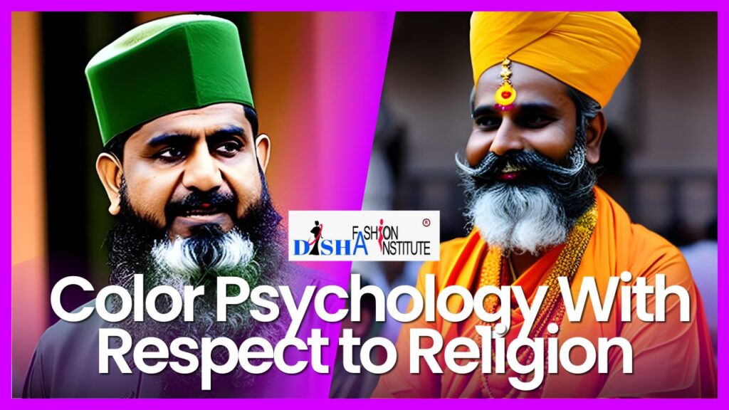
Just like in politics, colors can represent certain religions. To avoid unintentionally offending anyone through your designs, it’s important to be aware of these color/religion associations. Here are some examples:
Green is considered the holy color of Islam. It holds a special significance in representing fertility, life, and paradise within Islamic beliefs.
Hinduism is represented by Saffron where saffron is considered to be the color of courage and sacrifice.
In Hinduism, many gods are depicted with blue skin. Blue carries a meaning of divinity, transcendence, and cosmic energy in Hindu mythology.
Judaism is often represented by the color yellow. It symbolizes light, wisdom, and knowledge in Jewish culture.
White is linked to peace across many religions. It signifies purity, spirituality, and enlightenment in various faiths.
This information becomes particularly relevant when designing a website or visuals that have specific connections to religion. It highlights the importance of having a good understanding of your audience during the design process.
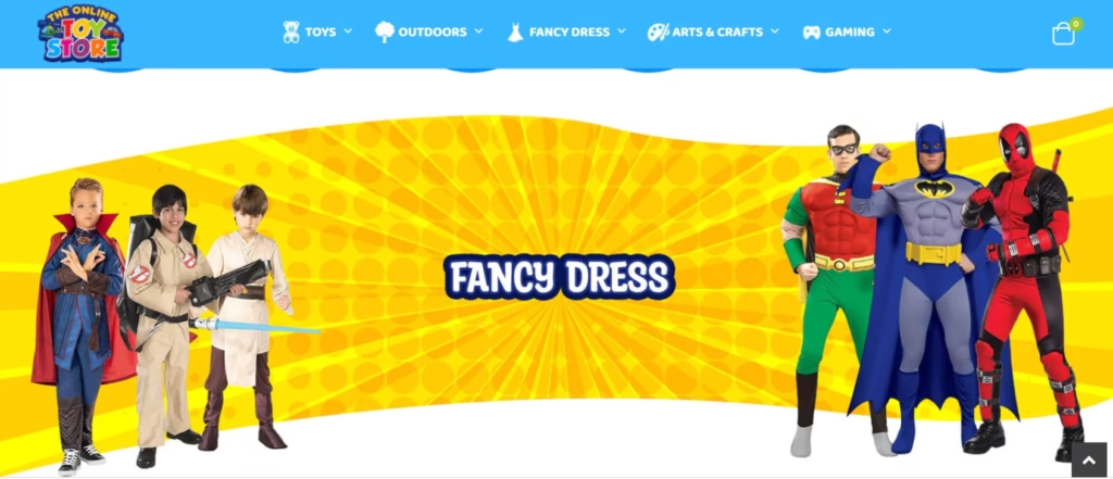
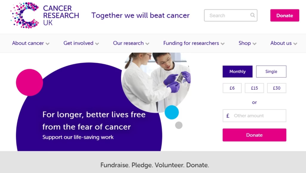
#10 Age affects people’s colour psychology
Certain colors maintain a strong preference throughout individuals’ lives, regardless of gender. Notably, blue and red consistently remain popular choices. Interestingly, yellow tends to captivate children’s attention, but as they transition into adulthood, its appeal diminishes.
One noteworthy point is the correlation between maturity and color preferences. As individuals mature, there is a noticeable inclination towards hues with shorter wavelengths, such as blue, green, and purple. In contrast, colors with longer wavelengths, including red, orange, and yellow, tend to evoke less enthusiasm among individuals as they age.

It is important to acknowledge that people’s color preferences are influenced by the social and cultural changes they experience throughout their lives. These shifts can significantly impact their favourite colors. As a designer, understanding the color preferences of different age groups can prove invaluable.
For instance, when designing a website for a toy store or a children’s TV channel, incorporating bright colors, especially yellow, can enhance the visual appeal and resonate with the target audience.
Conversely, when developing a website for a charity catering to the older generation, colors like blue, green, or purple tend to be more well-received. These colors can effectively engage and connect with the intended audience, aligning with their preferences and creating a harmonious visual experience.
Undoubtedly, the world of color is a complex subject with multifaceted dimensions. It possesses an inherent ability to subliminally convey values and narratives, making it an indispensable tool for designers. Through thoughtful and intentional use of color, we as designers can evoke specific emotions, convey messages, and create compelling visual stories that resonate deeply with individuals.
#11 Color Psychology in Digital and Analog World
As we have discussed so far, depending on different factors and learning from mother nature, we human beings respond differently to different colors. For example, Green is the most viewed color in the world. It signifies the color of life, renewal, nature and energy. it is associated with meanings of growth, harmony, freshness, safety and fertility. This is why you will notice in different websites, submit, sign up buttons are generally colored in green. On the one hand, red stands for danger violence, anger and aggression this is why most of the cancel. delete buttons on different websites are colored in red in order to draw the attention of the user so that the user thinks again before performing the action. Red is universally used as the color that means stop. Even in the traffic lights, when the red light is on, that means you should stop. On the other hand, red is also used as the color of love.
#12 Color Psychology and Consumer Behaviour
By now we have understood the importance of color in our daily life. A study says that color influences 85 per cent of shoppers to purchase decisions. About 62 to 90 per cent of the product assessment is based on colors alone. Colors increase brand awareness by 80 per cent. In the fashion industry color has the most powerful impact. Color attracts attention, creates an emotional connection and leads the consumer to the product. Color is often a primary reason why a person is attracted to and purchases a particular item of clothing. Clothes of a specific color can influence feelings and attitudes associated with those wearing the cloth. For example, a red outfit could make you feel confident and passionate and might attract attention towards you. Some experiments have found that waitresses wearing red tend to receive higher tips.
Conclusion
In conclusion, the mesmerizing impact of color psychology in fashion design cannot be underestimated. Color holds the power to create contrast, establish harmony, and evoke emotions within garments. Fashion designers leverage color psychology to craft visually pleasing combinations, employing various color schemes. Understanding the significance of color in fashion design is essential for effectively selecting colors based on their psychological impact. Whether it’s conveying information, symbolizing cultural or religious associations, or influencing consumer behaviour, color psychology plays a transformative role in the world of fashion design.
Our next topic is color theory in fashion design where we will study the color wheel in fashion design and different types of color schemes in fashion design.
All Topics on Elements of Design in Fashion
To delve into all the subjects about elements of design in fashion, simply navigate through the list of blog posts below. Click on the headings to access the articles you’re interested in reading.


All Topics on Principles of Design in Fashion
To explore all topics on principles of design in fashion, browse the list of blog posts below and click on the relevant heading to access the articles.


Embracing Harmony in Fashion Design: The Art of Creating Coherent and Captivating Collections

Explore Free Courses
Begin your fashion journey with our free fashion design foundation course. Dive into the world of style and creation today!
Join Fashion Designing Course
Enrol in our certificate courses for fashion designing and textile designing