
Table of Content
- #1 Contrast of Hue
- #2 Contrast of Saturation
- #3 Contrast of Light and Dark
- #4 Contrast of Cold and Warm Color | Contrast by Color Temperature
- #5 Contrast of Complementary Colours
- #6 Simultaneous Contrast | Optical Illusion with Colours
- 7# Contrast of Extension | Contrast of Proportion
- #8 Contrast of Neutral Colours
- Conclusion
- Related Topics
#1 Contrast of Hue
One of the most apparent ways to create colour contrast in fashion is by juxtaposing different hues. Hues, in this context, refer to pure colours without any mixture of white, grey, or black. The greater the distance between hues on a colour wheel, the more pronounced the contrast becomes. By pairing colours from opposite ends of the spectrum, such as vibrant red and deep green, you can achieve a striking and attention-grabbing effect. But considering the exact opposite pair of colours in the colour wheel creates the contrast of complementary colours. We have discussed the same in the later part of this blog post.

#2 Contrast of Saturation
Saturation refers to the intensity or purity of a colour. Contrasting saturation involves combining vivid, intense colours with muted or diluted shades. This creates a captivating interplay that draws the eye. For instance, pairing a rich, saturated blue with a softer, pastel yellow can produce an alluring contrast of saturation.
In the picture below, only the middle box contains the pure hue, and all other boxes contain intermediate shades by mixing grey with the pure colour. You can understand how the pure hue appears vivid when placed alongside the muted shades.
#3 Contrast of Light and Dark
Playing with the contrast between light and dark values can lead to visually compelling outfits. This technique combines shades that differ significantly in brightness level or tonal value. A monochromatic ensemble, using varying shades of a single colour, can elegantly showcase this type of contrast.

#4 Contrast of Cold and Warm Color | Contrast by Color Temperature
You can create a colour contrast that evokes different emotions and moods by juxtaposing warm and cool colours. Warm colours like red, yellow, and orange can be paired with cool colours like blue, green, and magenta to generate a visually stimulating effect. This contrast adds depth and complexity to your outfit choices.
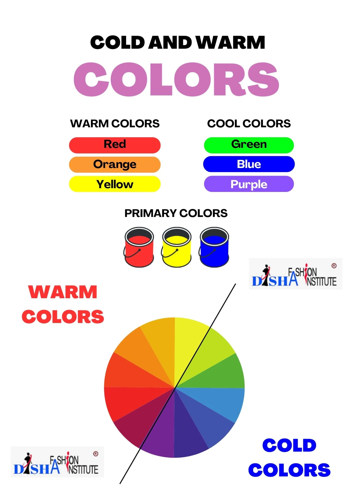
The following dress contains both cold colour, i.e. blue, and warm colour, i.e. red, which forms a colour contrast generating a visually stimulating effect.

Read the colour theory in detail to understand the colour wheel and how to use it in fashion.
Colour Theory in Fashion Design
#5 Contrast of Complementary Colours
Complementary colours, positioned opposite each other on the colour wheel, create a natural and harmonious colour contrast. Pairing these colours, such as red and green or blue and orange, enhances each hue's vibrancy, making them stand out while maintaining balance.
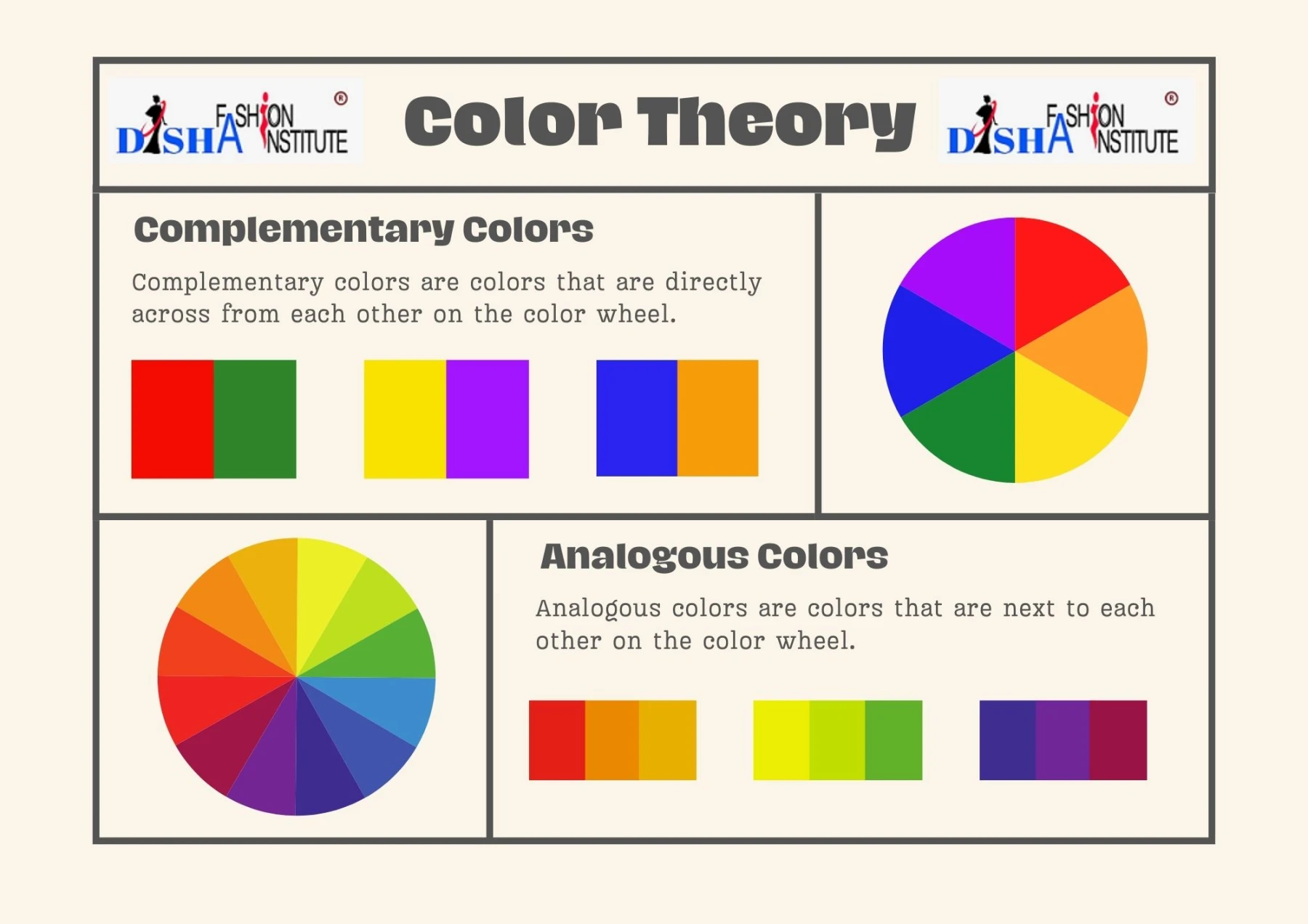
In the below example, blue and orange are complementary colours.


Read the colour theory in detail to understand the colour wheel and how to use it in fashion.
Colour Theory in Fashion Design
#6 Simultaneous Contrast | Optical Illusion with Colours
Simultaneous contrast is an intriguing phenomenon where colours seem to change when placed next to each other. This occurs because our eyes naturally seek complementary colours. For example, if you gaze at a yellow object for a while and then shift your focus to a grey or white surface, you might perceive an illusion of purple. This contrast can lead to captivating optical illusions and creative outfit combinations.
7# Contrast of Extension | Contrast of Proportion
Contrast of extension involves playing with the relative areas of colour patches. You create an engaging visual effect by combining colours in differing proportions where one colour occupies a significantly larger area than the other. This technique can be particularly impactful when experimenting with patterns and colour-blocking.
#8 Contrast of Neutral Colours
White, black and other neutral colours can always create a colour contrast with any hue. This is a very creative way to create colour contrast in clothes.

